Propaganda3
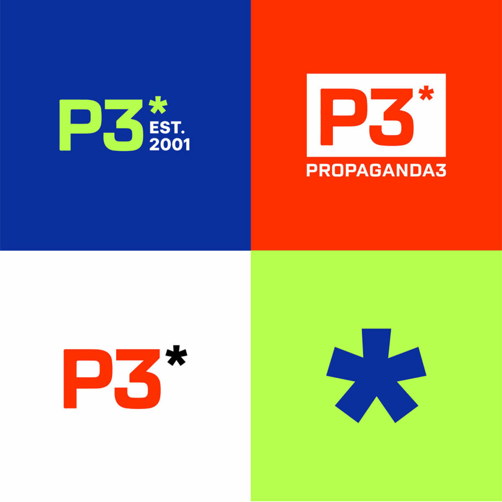
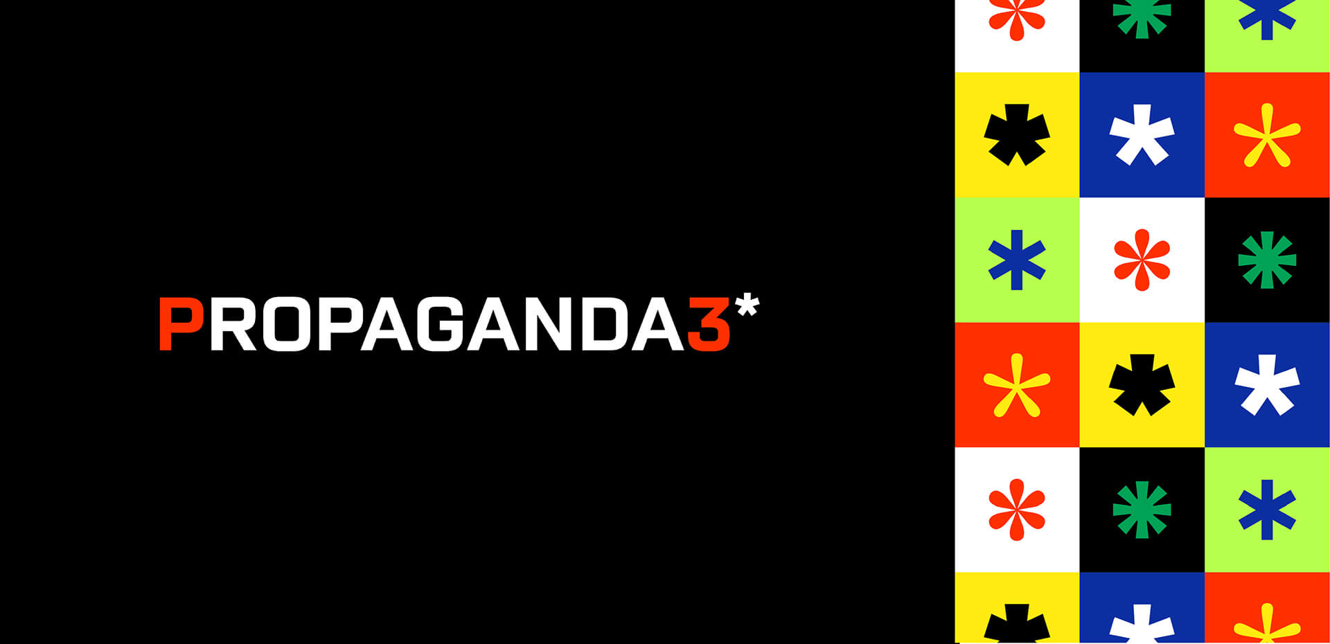
Propaganda3, a digital marketing agency in Kansas City, MO, came to me looking to elevate their brand without losing the equity they had built with their current mark and color-scheme. Essentially, an evolution, not a revolution. We updated their typeface and took their 5-point star, evolving it into an asterisk that signaled there’s more to be discovered about the company, employees, and creative work beyond what meets the eye. This asterisk can stand alone or be paired with a family of asterisks for patterns and play. For color, we added a few bright secondary colors to their standard red, black, and white, allowing P3 to be more bright and modern while keeping their primary palette. Throughout the process I worked with the P3 team to ensure that their brand kept its original integrity while allowing it to evolve into something that could compete in an ever changing digital space.